top of page

I art directed and designed a Brand Film for a modern supplement company called Thorne. 

Role: Concept Design & Treatment, Art Direction Lead, Design, and artist management.

Thorne, maker of health supplements and at-home testing kits, came to us at buck for a brand film. They walked out with an entire motion system and an expansive toolkit that could carry them into the future.

Credits : 

Client : Thorne

Studio: Buck.co

EP: Joe Nash

GCD: Ben Langsfeld

ACD: Chris Palazzo

Senior Art Director: Liron Eldar-Ashkenazi

3D Design: Brendi Wedinger

Motion/Edit: Fede Reano, Will Burkart

Simulations: Ehsan Parizi, Fede Reano

Designer/Boards: Liron Eldar-Ashkenazi

Photography: Julia Hembree

Producer: Irka Seng

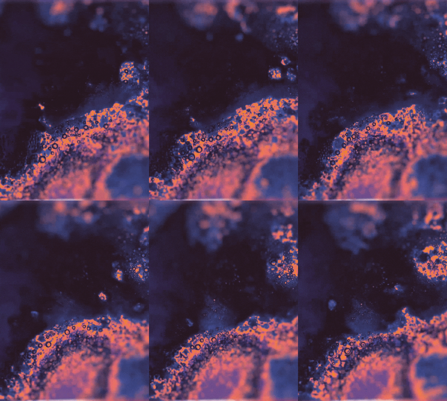
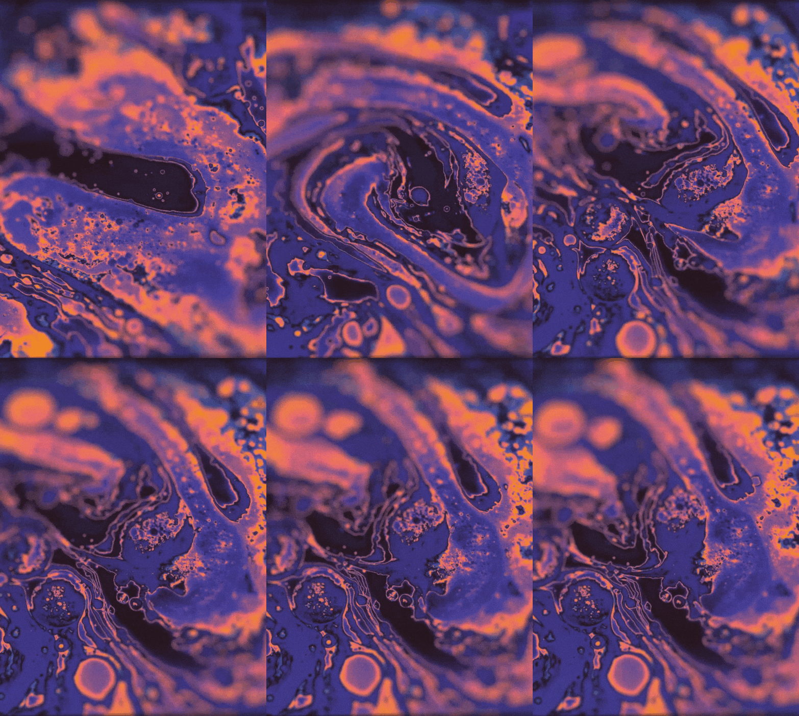
To transform the brand, we brought in tactileness, warm colors, organic lines and shapes, raw ingredients, and a fluidity between micro and macro scales. We put it through the lens of art and photography. And most important of all, we brought in a human touch. These all combined to produce a look we call ‘warm science’.

3D sculptures, Artistic powders,  Supplements done differently.

Our client wanted to make sure whatever we make feels artist and elevated, nothing that feels like pharmaceuticals or hyper scientific; To transform the brand, we brought in tactility, warm colors, organic lines and shapes, raw ingredients, and a fluidity between micro and macro scales. And most important of all, we brought in a human touch. These all combined to produce a look we call ‘warm science’.

Typography as a guiding star for social, and what happens to the piece and we created a spot without it.

We created spots with and without typography to serve different end goals. For social we didn't use voice-over, as it would have felt a bit much in such a fast pace piece, and may had steer us from licensing such an amazing music track. For Thorne's Website we created a typography-clean looping montage to welcome viewers as they come into the landing page, showcasing the visual system without forcing anyone to read through. One piece was about the script and the storyline, the other was about the emotion, the brand atmosphere and the beauty of the art.

Thorne_Type_Exploratory_A01_1.gif

An art director's shot

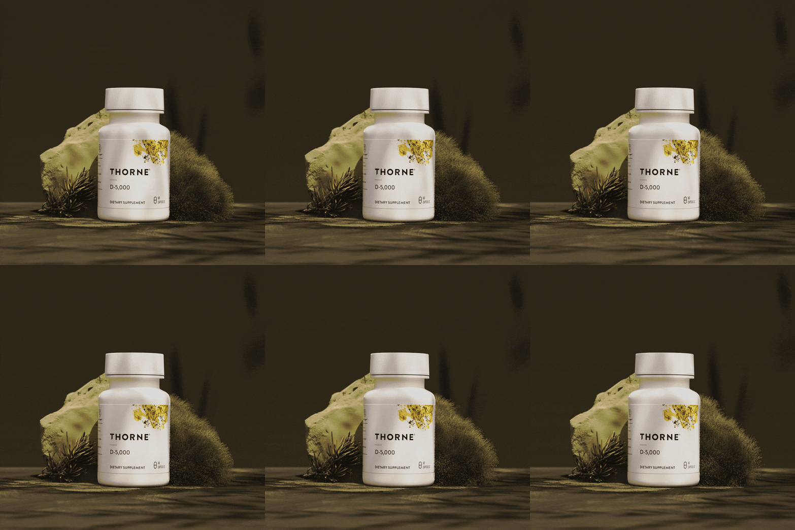
As a senior art director I usually set the design tone with the creative early on, and then make sure we’re hitting that note throughout the entire project, up to finishing. Sometimes, I also get a couple of shots that are “mine”, start to finish I concept and build them, light and render, these I consider my babies. This product hero one, is one of those.

Reason to believe

Aside from the main 60, 30 & 15, we also created dedicated social shots to highlight different features in the brand. 

SH140_UpchartSlateRock_small.gif
Thorne_Edit_60sec_A21_mattes_1.gif

Design boards as storyboards

CC_03_noglass_2.gif

Instead of showing sketches and black and white storyboards, we delivered fully designed boards for approval, making the process much easier once the client saw the overall look early on. 

Asset Creation

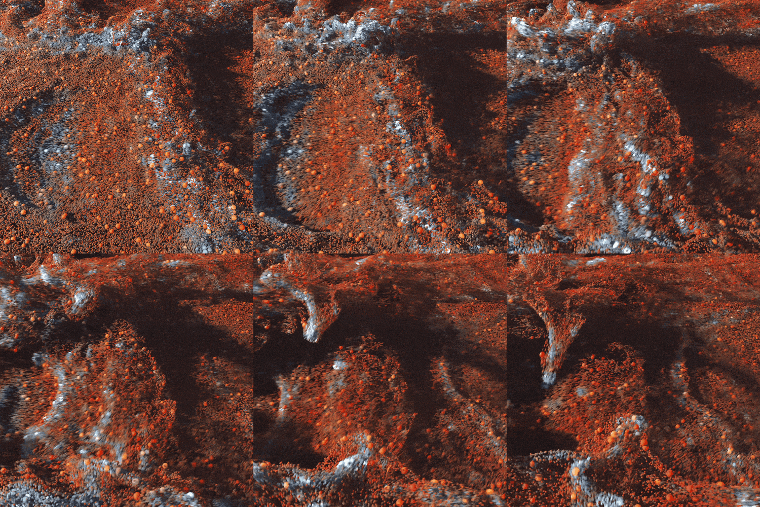
Each texture and image in the early boards were recreated and redesigned in the asset creation stage, where we crafted simulations and product renders for use within the final piece.

THRN_EP_STRESS_v015_gen1_v15_SMALL.gif
SH160_D5000.gif
CC_03_noglass.gif
THRN_EP_HEAVYMETALS_G0_v0016_HEAVYMETALS
SH050_sculpture_small.gif
abc_Particles_Import_V15_Particle_from_I

Designing in the social era

In order to eliminate the possibilty of a social redesign or reduction, we made sure that our initial storyboard and motion designs were created using strict social media guidelines and grid, making the process of creating for Story and Square size a breeze, without losing any of the style.

Thorne_Type_Exploratory_A01_Grid_sm.gif
unnamed.png

fin

bottom of page