top of page

Cash App Evergreen Design System
2023 — 2024


We set out to reimagine the Cash App spatial illustration system driven by a mission that demanded both strategic precision and creative vision.

Our task was to gracefully evolve the brand's bold and colorful persona to its next phase as the coolest kid in the BLOCK™ group.

Role: Creative Director

Credits : 

Executive Producer: Russell Greene

Chief Design Officer: Ben Langsfeld

Creative Director: Liron Eldar Ashkenazi

ACDs & Art Directors: Pedro Veneziano, Wendy Eduarte, Emily Davis, Florence Dagostini, Mollie Ableman, Mary Kate Henry

Ideation: Florence Dagostini, Emily Davis, Joy Tien, Tuo Kan, Matthew Kam, Syd Fini, Twisha Patni, Auron Luxe

3D Leads: Bill Dorais, Auron Luxe, Taylor James

3D Design & Animation: Auron Luxe, Will Burkart, Jonas Nunes, Marcio Flausino, Bihhel Barbosa, Nachei Sanchez, Roberto Juarez, Rolando Barry, Marcus Bakker, Taylor James

Strategy: Marla Moore, Asia Hunt

Producers: Andre Araujo, Willa Gross, Alex Decaneas, Monica Lynn

Production Coordinator: Dani Ortega

Graphic Design: Danilo Rodrigues

2D Animation: Eduardo Altarriba, David Hobizal

Editor: Dave Conte

Talent Operations Managers: Sarah Pinhancos, Talia Lamdan

Part+ Sum: Leila Wu, Sally Zhang, Months Selvamuthu, Eiliot Hasiuk

Client: Cash App (by BLOCK™)

Head of Brand Creative: Blazo Calovic

Creative Director: Sylvain Theyssens

Creative Producer: Jose Diaz

Brand Identity Creative Director: Deva Pardue

Art Director: Milo Milosevic

3D Design Lead: Daniel Belay

Head of Creative Production: Adeana Saint-Hilaire

Producer: Anisha Wadhwani
 

The Spirit - A delicate art

We approach transforming a brand’s visual identity as a delicate art, requiring a deep understanding of the brand's essence and the nuances that make it unique. Cash App already had that — an irreverent spirit, bold colors, and a vibe that resonated deeply with its audience. Our task was to infuse this established essence with new energy while honoring the character that had always set it apart. We needed to create rules that would inspire, not limit. In collaborating with Cash App, we found that sometimes just a few principles executed with precision and rigor can make all the difference. 
 

We set out to create cohesion with the existing brand language already championed through other channels—among them social media and a legacy website that would take some time to change—to bridge the worlds of product and marketing and craft a narrative that was as compelling as it was consistent. Rooted in the principles of clarity, brilliance, and security, Cash App's new POV had to come through while still remaining the special voice it always was and always will be.
 

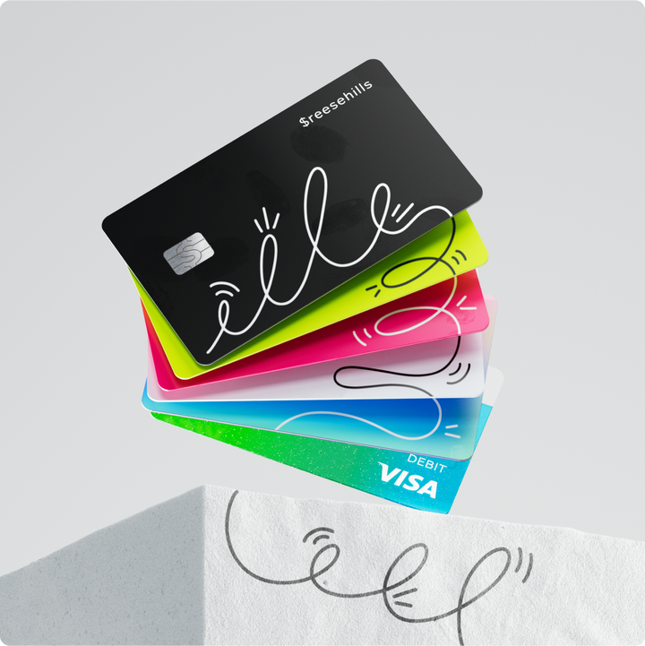
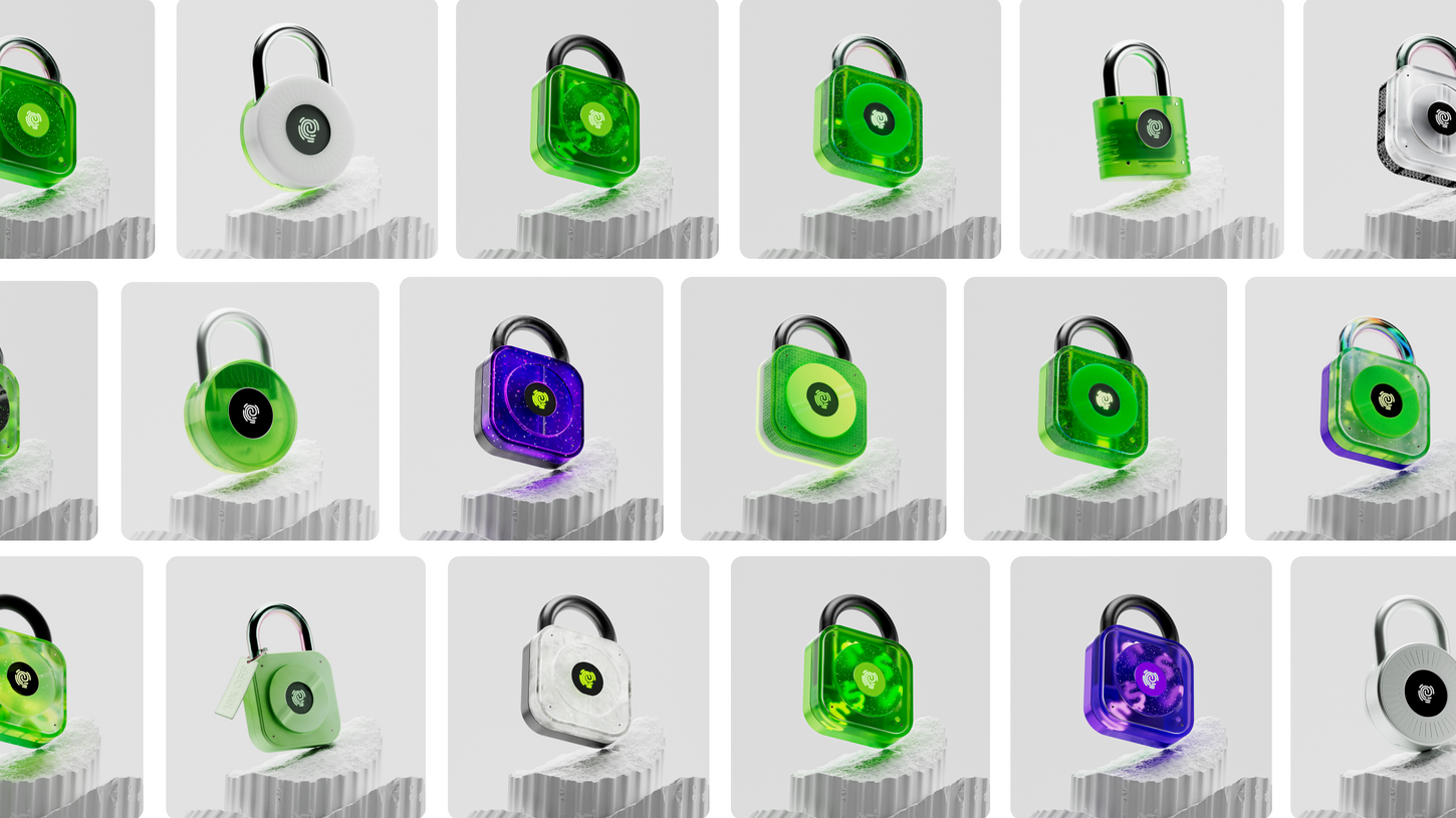
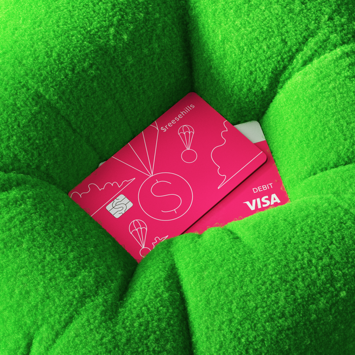
Each image, icon, and asset we created was meticulously examined and pressure-tested. From paracords to parachutes, locks to coins, paper money to checks, our concepts were explored and developed with both a macro and micro approach to storytelling. We asked ourselves questions like, “How do we represent banking in a way that feels traditional, contemporary, and forward-thinking, all at once?

Throughout our journey, we were committed to building upon the solid foundation that was already in place. We gently guided the existing system into a more unified and mature expression of itself, emphasizing conceptual thinking. We dedicated a significant portion of the project timeline to ideation, concepts, and composition, avoiding an immediate dive into design, as that often leads to trendy work that doesn’t stand the test of time.

We envisioned a world where every Cash App interaction, from the tiniest icon to the grandest campaign, was connected by a thread of creativity and purpose—a ripple that started with our illustrations and spread across every touchpoint.

The Cash App team was clear about what we shouldn’t do, and we agreed. We refused to strip away the irreverent spirit that had always set Cash App apart. The last thing we wanted was to make work that blended in with the competition, for Cash App to become another minimalistic brand lost in a sea of sameness. 

Cash App had always been about more than just numbers; it was about personality, character, and a touch of rebellion. So even when it came to territories like Banking, Commerce, Security, and Scam Protection, preserving that unique identity was paramount. Success, as we defined it together, meant creating a system that was instantly recognizable yet endlessly adaptable.


Cash App had always existed in the space between the weird and the wonderful, a brand that didn’t just dabble in the world of finance but dove in with an inclusive identity that was as exciting as it was approachable.

We took the key ingredients that had always made Cash App unique and mixed in a new perspective—one that was more mature, more focused, and lighter in touch. We envisioned compositions that balanced tactile structure with fluid abstraction, visuals that breathed with a new lightness while still holding onto that unmistakable Cash App edge.


To ensure that the new visual language would not only resonate but also endure, we crafted a comprehensive set of deliverables. First, we developed a design strategy and purpose materials that would serve as the philosophical backbone of the project, guiding every decision with intention and clarity. 

Alongside this, we built an entire 3D illustration library—each asset meticulously crafted and delivered with source files, offering flexibility and future-proofing for the brand.

Lastly, to maintain consistency as the brand grew and evolved, we established detailed 3D brand guidelines, ensuring that the spirit of Cash App would shine through in every visual touchpoint.


In tandem with developing this visual language, we also initiated a dedicated workstream focused on market research and testing. We tested our creative concepts on social channels such as TikTok, Instagram, Google, and YouTube, gathering real-world insights that allowed us to refine and adapt our approach in real time.


The marketing assets took on a life of their own, requiring a bespoke visual language crafted specifically for this function. These assets had their own aesthetic and way of being, designed to captivate and engage audiences in the fast-paced environments of social media. Simultaneously, we brought these creations to life, infusing movement and energy into the brand in ways that captured attention and stirred emotions.